Noisli is a website that lets you mix different sounds to create relaxing background noise. While the background noise generation is really cool, what caught my eye is the subtle background colour changes.
When you visit the website, the background colour is a muted green. After a while, the background colour changes into a different colour. Their colours are a mix of muted and bright, but they all look beautiful against the white font, and the background colour transitions take long enough that it’s not jarring at all.
This effect is so cool that I wanted to check out how to make this myself!
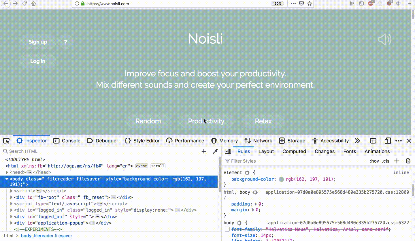
On inspecting Noisli’s page, we notice a background-color property that changes slowly. One thing to note is that the changing background-color property is added as a style tag to the body, which hints that Noisli probably uses JS to animate their background color.
But let’s try using CSS Animations!
We define the animation-name and the animation-duration properties for the body.
body {
  animation-name: change-background;
  animation-duration: 5s;
}
Then, in the keyframes block, we can define the states of the animation. Here, I’ve defined two states with two different background colours.
@keyframes change-background {
  from {
    background-color: rgb(138, 220, 179);
  }
  to {
    background-color: rgb(44, 154, 183);
  }
}
Here’s the codesandbox. Click Start Animation to see the background colour change!
To add multiple colours, we can redefine the keyframes with the states at different points of the animation, using percentages!
@keyframes change-background {
  0% {
    background-color: rgb(138, 220, 179);
  }
  50% {
    background-color: rgb(44, 154, 183);
  }
  100% {
    background-color: rgb(39, 174, 96);
  }
}
Here’s the codesandbox.
But it changes back to a white background colour after its done. We could use the animation-fill-mode property, which decides how the styles apply before and after it executes. When setting animation-fill-mode to forwards, the animation target will retain the styles applied on the last keyframe even after the animation is done playing.
body {
  animation-name: change-background;
  animation-duration: 5s;
  animation-fill-mode: forwards;
}
Here’s the codesandbox: now it stays the last colour. But we need the animation to keep repeating. For this, we can use the CSS animation-iteration-count property, which specifies the number of times we want the animation to play. The best part is that its value can be infinite, resulting in an infinitely looping animation.
body {
  animation-name: change-background;
  animation-duration: 5s;
  animation-iteration-count: infinite;
}
In this codesandbox, I’ve increased the animation-duration to 30s, and increased the number of keyframes so that it loops through 10 colours. I’ve used the same background-color for the 0% state and the 100% state so that the looping is smooth.
There’s a difference between Noisli’s changing background colour and this one. In our animation, the background colour keeps changing slowly, constantly. On Noisli, a background colour remains the same for 20s, before taking 10s to transition into a different background colour. How do we add this 20s pause?
Looking up CSS animations, we have a couple of properties that might seem useful but they don’t actually help.
- The
animation-delayproperty only adds a delay to the beginning of an animation, and won’t help in our case where we want a pause at each keyframe. - We have a property called
animation-play-state, which can be set to running or paused. While this may seem useful, we’ll have to use Javascript to toggle between two CSS classes, one withanimation-play-stateset torunningand another set topaused. This is probably more useful in a situation where you pause and resume an animation based on user interaction, such as clicking, as opposed to preprogrammed pauses based on time.
What we can do instead is, add multiple keyframes in the same state!
Right now, we have ten colour changes, which look like this:
@keyframes change-background {
  0% {
    background-color: rgb(138, 220, 179);
  }
  10% {
    background-color: rgb(44, 154, 183);
  }
  20% {
    background-color: rgb(39, 174, 96);
  }
  /* and so on */
}
Now, let’s suppose we need the first background colour to stay the same for 4s and the transition to the second background colour takes 2s, that means that we need to add a new keyframe two-thirds of the way to the second keyframe, with the same value as the first keyframe. Our first keyframe is at 0% and the second is at 10%, so we repeat the first keyframe value at 6.66%.
@keyframes change-background {
  0% {
    background-color: rgb(138, 220, 179);
  }
  6.66% {
    background-color: rgb(138, 220, 179);
  }
  10% {
    background-color: rgb(44, 154, 183);
  }
  16.66% {
    background-color: rgb(44, 154, 183);
  }
  20% {
    background-color: rgb(39, 174, 96);
  }
  /* and so on */
}
Now we need to recalculate the animation-duration: Since 10% of our animation should take 6s (a 4s pause and a 2s transition), the whole animation needs to take 60s.
Here’s the final codesandbox: we’ve made an infinite-looping background-colour-changing animation with pauses, that looks just like Noisli! I hope you had fun doing this with me!